The Ring effect with TailwindCSS

Recently I was watching a movie on my Z7 top box and notices a loading screen of the Z7 which reminded me of the movie "The Ring". I decided to try to implement a loading animation which looks pretty similar with a floating, blurry ring. Here is what I cam up with:
Demo showing the result: Floating Ring Effect
Let's explore the code:
First, I have created four different divs which are wrapped in one container. The container is defined as position relative so we can position the child DIVs absolute. This way the child DIVs can overlap each other and create the effect we would like at the end.
All DIVs are given a ring-8 and border-8 class. To create a circle we will apply rounded-full to all DIVS. Regarding color, I have chosen border-white and ring-white classes (but of course we can play around with different colors as well). The last common piece for all DIVs is the width and height of w-48 and h-48.
<div class="bg-black min-h-screen w-full relative p-12">
  <div class="w-48 h-48 ring-8 border-8 ring-inset border-white ring-white rounded-full"></div>
  <div class="w-48 h-48 ring-8 border-8 border-white ring-white rounded-full -mt-48 ml-1"></div>
  <div class="w-48 h-48 ring-8 border-8 border-white ring-white rounded-full -mt-48  mr-1"></div>
  <div class="w-48 h-48 -mt-48 ring-8 border-8 border-white ring-white opacity-70 rounded-full"></div>
</div>
Now let's create the floating effect. I have created two new animations floatA and floatB to make two diffs float around. The logic behind floating is illustrated as follows:
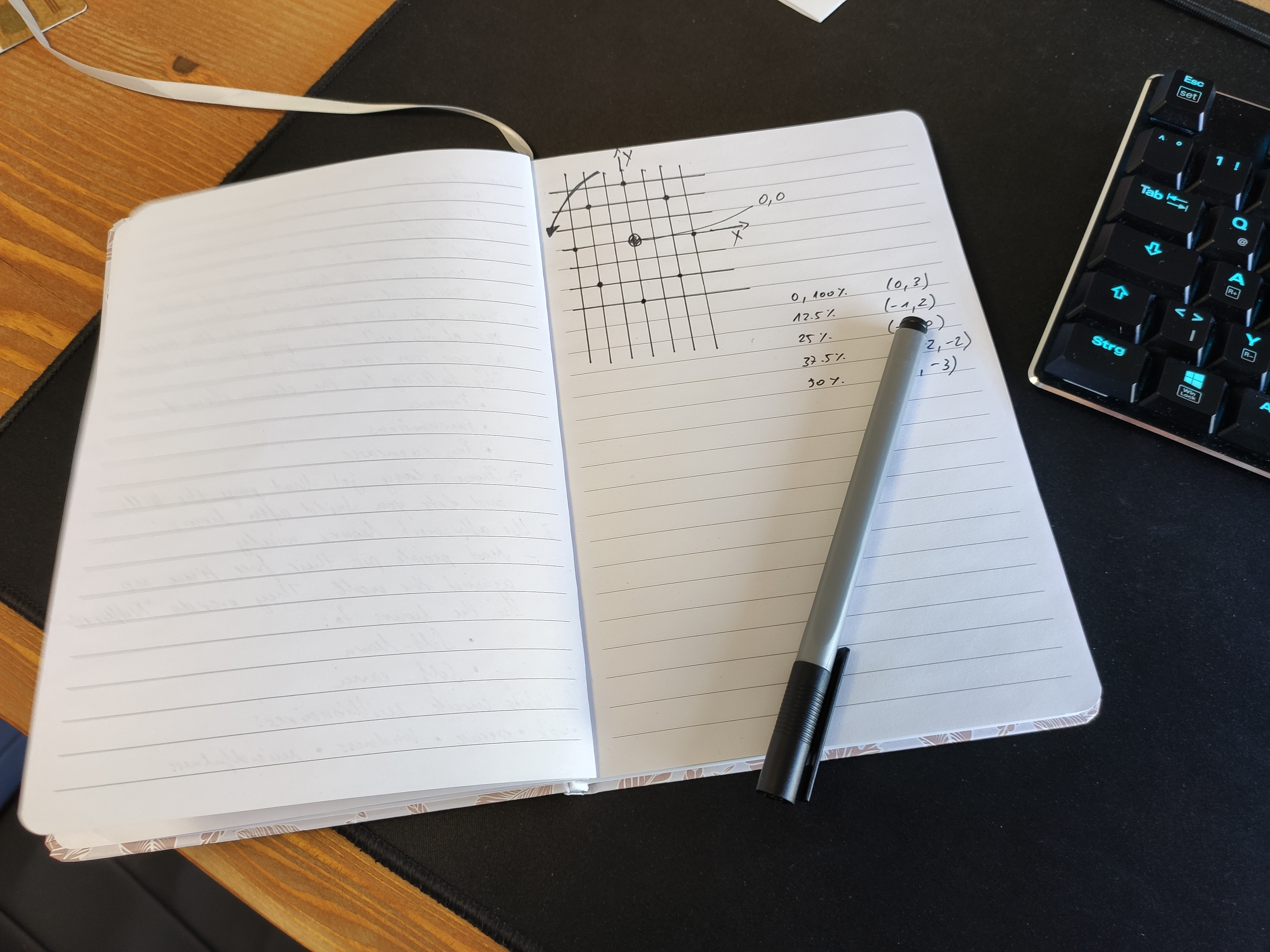
There is no big magic behind it. I slowly move the DIV around between 8 points, which more or less resemble a circle in a coordinate system.
tailwind.config = {
      theme: {
        extend: {
          colors: {
            clifford: '#da373d',
          },
          animation: {
            floatA: 'floatA 7s linear infinite',
            floatB: 'floatB 7s linear infinite',
          },
          keyframes: {
            floatA: {
              '0%, 100%': { transform: 'translateX(0) translateY(8px) opacity(100)' },
              '12.5%': { transform: 'translateX(-4px) translateY(4px)' },
              '25%': { transform: 'translateX(-8px) translateY(0)' },
              '37.5%': { transform: 'translateX(-4px) translateY(-4px)' },
              '50%': { transform: 'translateX(0) translateY(-8px) opacity(50%)' },
              '62.5%': { transform: 'translateX(4px) translateY(-4px)' },
              '75%': { transform: 'translateX(8px) translateY(0)' },
              '87.5%': { transform: 'translateX(4px) translateY(4px)' },
            },
            floatB: {
              '0%, 100%': { transform: 'translateX(-4px) translateY(4px)' },
              '12.5%': { transform: 'translateX(-8px) translateY(0)' },
              '25%': { transform: 'translateX(-4px) translateY(-4px)' },
              '37.5%': { transform: 'translateX(0) translateY(-8px)' },
              '50%': { transform: 'translateX(4px) translateY(-4px)' },
              '62.5%': { transform: 'translateX(8px) translateY(0)' },
              '75%': { transform: 'translateX(4px) translateY(4px)' },
              '87.5%': { transform: 'translateX(0) translateY(8px)' },
            }
          }
        }
      }
    }
We will assign the floatA and floatB animations to two of the DIVs. By adding opacity and filter blur-sm classes we can decide how much the static DIVs will shine throug the others and how much glow we will produce. And here is the final result:
<div class="bg-black min-h-screen w-full relative p-12">
  <div class="animate-floatA w-48 h-48 ring-8 border-8 ring-inset border-white ring-white rounded-full opacity-50 filter blur-sm"></div>
  <div class="animate-floatB w-48 h-48 ring-8 border-8 border-white ring-white rounded-full opacity-30 -mt-48 filter ml-1"></div>
  <div class="w-48 h-48 ring-8 border-8 border-white ring-white rounded-full opacity-30 -mt-48 filter mr-1"></div>
  <div class="filter blur w-48 h-48 -mt-48 ring-8 border-8 border-white ring-white opacity-70 rounded-full"></div>
</div>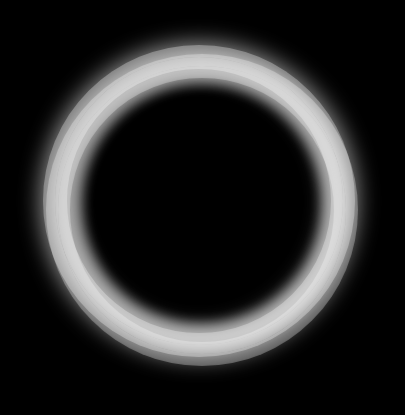
Not quite the result of the "real" ring from the movie but still not bad. With more blur and adaption of colors this can be for sure fine tuned even more.
Thank you for reading this far! Let’s connect. You can @ me on X (@debilofant) with comments, or feel free to follow. Please like/share this article so that it reaches others as well.